Attenborough Nature Reserve 7th December Linoprinting Workshop

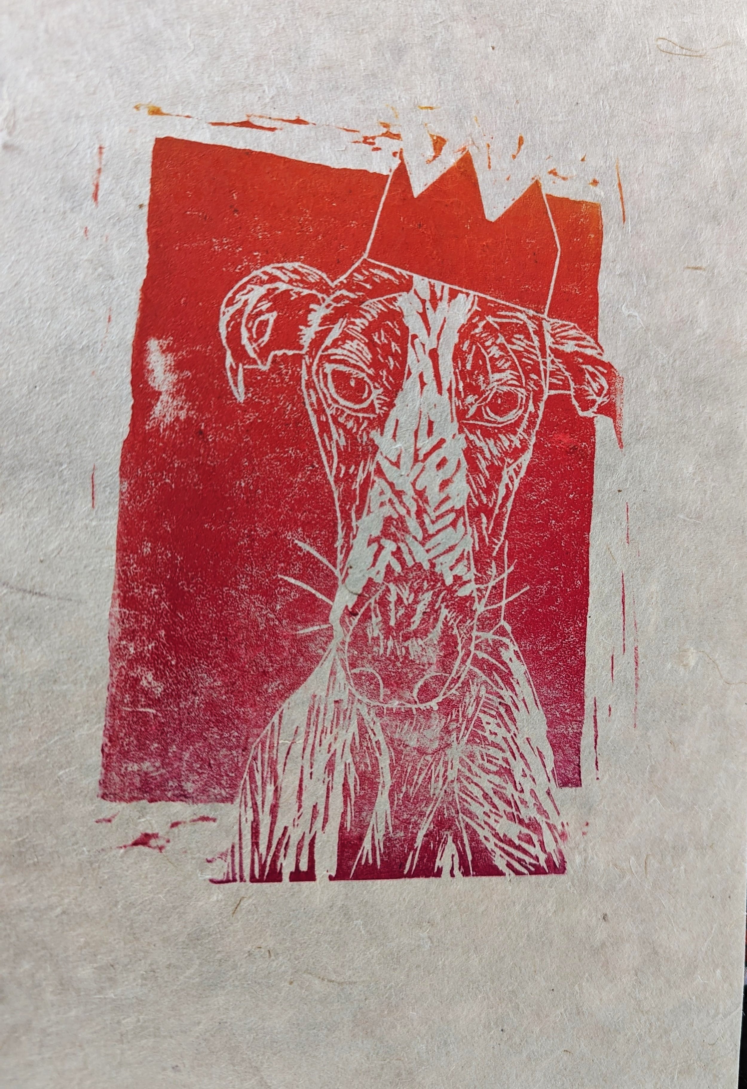
On December the 7th 2023 I had my first class for Lino printing at the Attenborough Nature Reserve. The class consisted of 4 attendees and we managed to produce some great prints and designs. The space for the day was just a bit past the main cafe in the nature reserve, with ample space and seating. Plus the food was excellent and provided some really good scrumptious meals for the day.

I’ll be having future classes at the Attenborough Nature Reserve on the 23rd of March. You can see the Eventbrite for future classes here on their page : Tickets here!

Yellowwood Cafe Linoprint Workshop 7th September 2023

Last year on September 7th 2023, I hosted a half-day Lino printing classes at the Yellowwood Café with the intention of doing more perhaps in the future. Iain being the business owner and proprietor was keen to allow me to arrange a day of unbridled creativity and fun for attendees. Since doing these classes, I’ve gained a lot of experience working with quite a few locals within Beeston.

Upstairs is a great space for these types of classes, and you can get in touch here at for your own inquiries www.yellowwoodcafe.co.uk

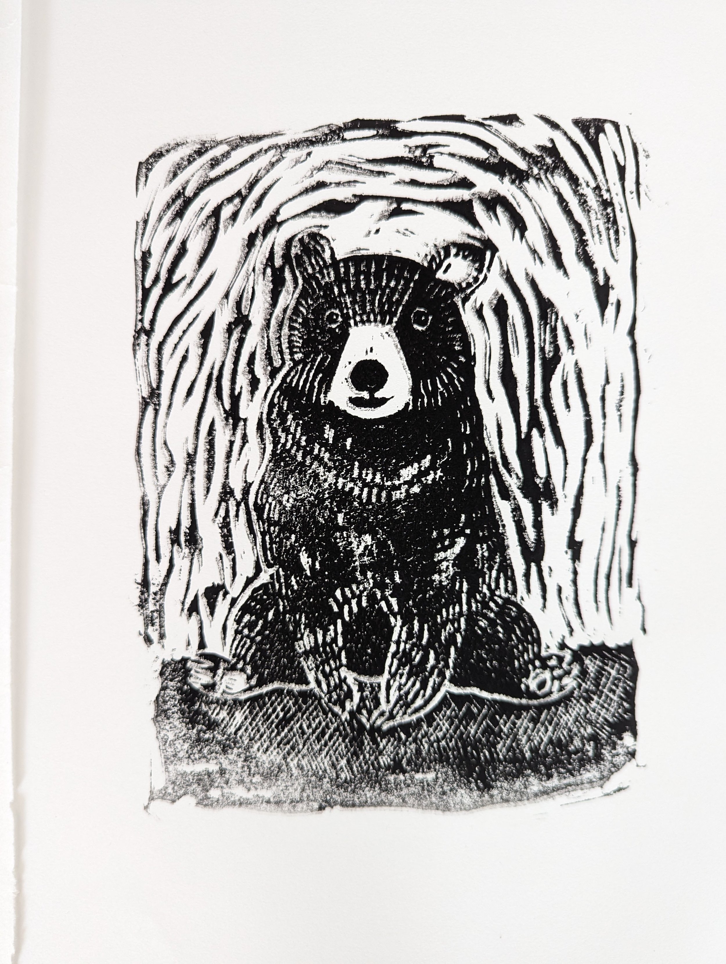
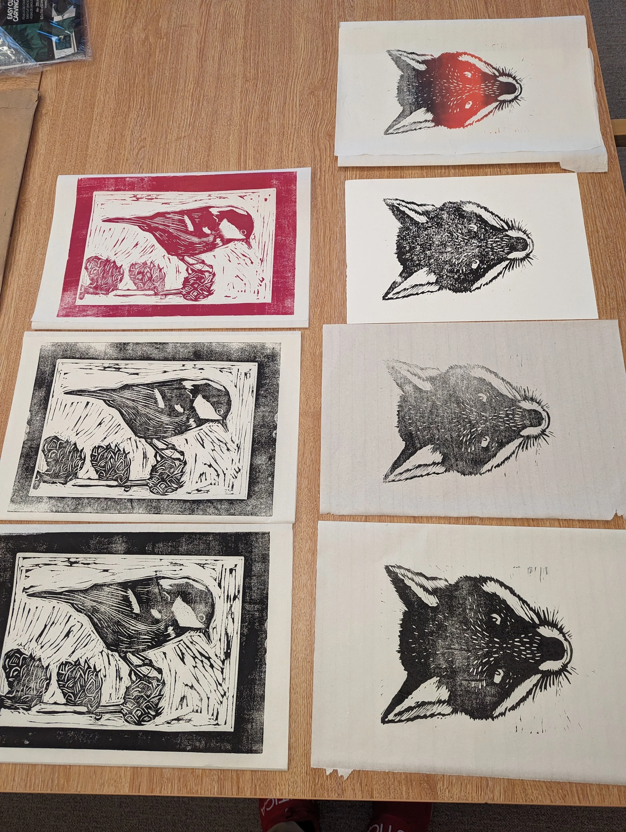
Here are a few prints from that half day class on the 7th of September. Importantly keeping fuelled with coffee and tasty hand-made food provided by Yellow wood :) Looking forward to hosting future classes here soon.

Linoprint giveaway 30th April - 8th May

Ahoy there! I hope you all are keeping healthy, and staying creative during these unprecedented times.

I am pleased to announce that I’ll be hosting a Lino-print giveaway starting this week from today to anyone who is interested in having a hand-pulled lino design print by me.

To enter this giveaway, all you need to do is comment on this blog entry which designs are your favorite, and state why. The deadline for the giveaway of the lino-prints is the 8th of May so next coming Friday. This giveaway will only be eligible for people within the UK only, so no abroad entries, please. I’ll be posting the prints off after the deadline to their new homes. For the delivery costs, it will be approximately £3.00 for each print so I’ll be accepting PayPal transfer to cover the delivery to the address of selected recipients my email is:- marcusg@live.co.uk

Each print is at A4 size and printed on Fabiano print-making paper at 300 gm, hand-signed with a range of different colors and finishes. In the attached image each print is labeled 1-16, so simply state the number assigned to the print you are most interested in.

I’d appreciate it greatly if you would share this across your social media pages, with a link to either my Instagram handle or this blog link and you’ll be considered also. Thank you again, and stay safe.

Carving the Black Knight

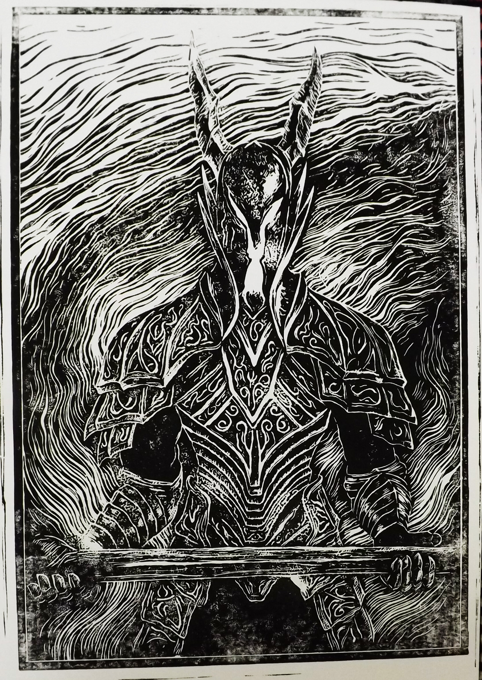
Since adapting with this pandemic I've been channeling my inner need to craft and create with my hands. Fiding more time, I’ve gone back to my illustrative roots (coupled with my graphic design, and animation studies) with practicing more lino-printing. The great thing with lino and woodblock printing is that it doesn't require so much space, so a kitchen table or office desk will work just fine. With each new piece tackled, I've tried to Incrementally increase the size of lino, this itself presents different challenges, and as expected takes a bit more time too, especially when it comes to printing and inking for instance (my favourite part!) Being a big fan of the Dark Souls series and the overall aesthetic of the games, I wanted to depict one of the cover characters notably the Black knight (a common warrior in Lord Gywn's army), in his spooky and gnarly armour. He certainly gives that Sauron vibe!

Usually, the first stage for me in creating any type of design comes with gathering references to begin a starting point. I'm working from in-game references I had a clear idea I wanted to go with it and with the various images of the knight available I dove right in sketching out the design straight onto the lino. I'd strongly recommend practicing a few sketches, and rough thumbnails to help solidify the visual direction what your design could take, doing this, though more exhaustive will tend to result in more well more conceived end result. In my designs and paintings for instance, rarely is the first design I produce the one I go within the end perhaps 10% but generally, it can be a case of establishing the sketch prior to doing anything else. Many illustrators and designers will preach this also if your compositional sketch isn't working have another go perhaps with a different approach, more references, and coupled with inspiration at hand.

When it came to carving out the main outline, I became quite conscious of the kind of marks I started to make, the thicker and simpler lines the better in my experience. Furthermore, I've found only by doing your first test print-proof you can get a decent idea of what changes/iterations you can make to it. Through practice like most things you become more confident in your approach and execution, and it becomes more about building up your visual vocabulary through memory and repetition.

Once you start carving away your lino-plate you get into a kind into a rhythmic flow, very similar to drawing. The thickness of the line, how much pressure you apply whilst carving, the sharpness of your tools, and angles also apply considerably. It is important to take regular breaks and try to pull yourself away from time to time, especially if you are working on a complicated/detailed design.

When it comes to carving tools I'm a massive fan of the Swiss-made ones that have proven to be a worthwhile investment. There are many cheaper alternatives on Amazon which shouldn’t cost all that more than twenty quid, so building up your tools over time is a good way to go.

I hope you have enjoyed this latest entry, and I’ll be looking forward to creating more lino designs to show you all soon! And my foray back to regular writing as well. Keep well, and keep creating.
Our End of Year show comes to an End!

This week has been a great journey of growth and personal development for me. We had a good number of Nottingham creative agencies come by on the Wednesday & Friday evening, and it was great to see them expressing interest in our End of year projects. I was chuffed to bits that I achieved Distinction level for this FMP rebranding project.

Ila's Tea Room - End of Year show.jpg

My Final major project went through quite a metamorphosis over three weeks with the ongoing support and input of my family and brother. I completed a branding project which I am proud of. Ila my client, unfortunately did not manage to attend; however, she was visibly impressed with the work I produced for her and wished me well in my future endeavors and career - and congratulated me via social media. Eventually I had that eureka moment, and began to understand what direction I was heading down - a more stream lined and minimal design. Distilling the design was the key.

The photos of the display below show my stand/stall, with the gracious help of Victoria Ashton (in our FdA group of 8) who constructed all of the plinths to display our printed assets. She is a real team player and helped us all out on the set-up day.

Printed branding stationery :- including flyers, business cards, menus and of course the brand-guidelines for Ila.

Printed branding stationery :- including flyers, business cards, menus and of course the brand-guidelines for Ila.

All the branding stationery from Ila's logo, her vinyl, chalkboard display to the guidelines were placed in context within mock-ups. These visuals were then printed out on mount-board, and highlighted our displays effectively in the gallery space. We were very pleased with the space at Broadway.

What I'm most proud of in this project was producing a high-quality logo, and a set of brand-guidelines ready to be potentially utilized. The additional research into current contemporary branding proved to be very valuable. I understand that branding is essentially about reduction and capturing the ethos of the company. Once I synthesized and absorbed this, it was full-steam ahead. 

Thank you very much for reading, and I'll keep you updated with what happens next in my creative ventures and career.

Me, Kirsten, Victoria, Imaani and Exza (part of TopFloorDesigns) at our preview night at Broadway Gallery last week.

Me, Kirsten, Victoria, Imaani and Exza (part of TopFloorDesigns) at our preview night at Broadway Gallery last week.

Here is me, my mother and my brother Sam!

Here is me, my mother and my brother Sam!

Ila's Tea Room - Branding guidelines

Hello! It's been a few tumultuous weeks of preparation and organizing for our End of Year show this coming June. Currently I have been working into finalizing the brand-guidelines for my final major project. The show will be happening from the 20th to the 23rd of June at Broadway cinema, leaving us the 17th and 18th to set up our display areas accordingly.

For Ila's Tea Room condensing her core brand values and beliefs into a cohesive guideline was important in establishing consistency. In this booklet crucial information regarding Ila's brand is presented, from the details regarding the selected typography/type to the colour swatches in the final logo design. Branding stationery from the A6 flyers, business cards, menu, small scale art prints for principle use. All the nitty gritty elements that go into managing a brand, such as her audience. She expressed keen interest in diversifying her target audience, to attract Nottingham's younger professionals and students for example. As the majority of Nottingham's hospitality/cafe' scene is predominantly comprised of the established corporate chains, understanding Ila's independent competitors was important – such as White Rabbit/Thea Caffe'.

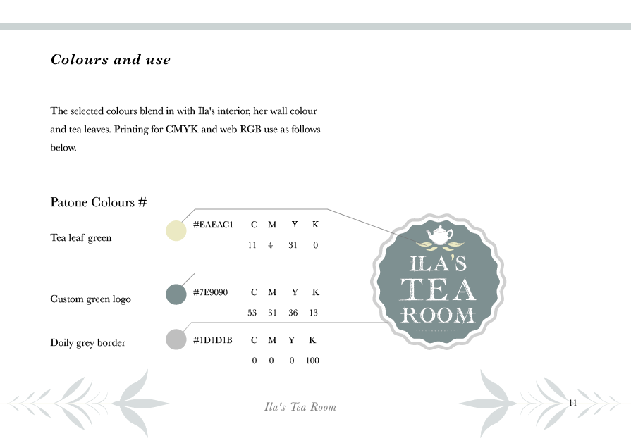
Colours and use page from the brand-guidelines. Outlining the RGB colours/pan-tone colours for printing and digital use.

Colours and use page from the brand-guidelines. Outlining the RGB colours/pan-tone colours for printing and digital use.

After previous visitations to Ila and her tea room, I further understood what kind of regular customers came to visit her. Her current brand 'Ila's Little Tea Shoppe', comments such as the shop's location were a regular concern. Customers would give feedback on specific logistical concerns about how to locate the tea-room, this was an important question and would be resolved by producing a vector map outlining its whereabouts. With a designed map as part of the menu, customers will be able to locate the tea-room with ease.


Example page from the Inspiration I collated in the beginnings of this project, from Charles Rennie Mackintosh's Willow Tearooms to the Yumchaa tea brand.

Example page from the Inspiration I collated in the beginnings of this project, from Charles Rennie Mackintosh's Willow Tearooms to the Yumchaa tea brand.

Ila's Tea Room - Final Project Update

Hello there! Since I handed in my final project from the 10th of May, I have been following upon the guidance of my tutors at Nottingham College and have embedded a more contemporary version which I produced over the weekend. Following advice from my brother and tutors (Richard/Sarah), I have implemented changes to further improve and make the design more suitable for mass audiences. What I have submitted below are the re-worked versions of the newer improved logo design, with carefully selecting colour palettes seen in Ila's tea shop I have went about - capturing the teapot and tea leaves with a suitable colour.

The amended design, after initial studies of Yumchaa's logos and more contemporary brands I pushed for a simplistic design - with a hand-drawn typeface and vector doiley effect, in keeping with some of the previous ideas in my file.

The amended design, after initial studies of Yumchaa's logos and more contemporary brands I pushed for a simplistic design - with a hand-drawn typeface and vector doiley effect, in keeping with some of the previous ideas in my file.

I have implemented a few situ images that tie the contemporary branding for Ila's here, they are an alternative branding concept to make it more accessible to a larger demographic. Understanding that the majority of her current audience base, consistent of more maturer ages having a clear and appealing brand image. Understanding the research that goes into a brand is one of the more critical aspects – who is your audience/market? What they want and how can your service/or product solve their problems and emotional needs. In this case for Ila's tea shop it was about creating a warm pleasant experience that will attract consumers from a myriad of ages, not just a maturer demographic – this was to be communicated through the branding elements I suggested in my proposal, such as the menu/flyers/business cards/brand guide-lines and the vinyl print.

Reflecting back to this Final major project, expanding upon more contemporary examples would have been much more beneficial earlier on. Having explored this then at a later, has definitely improved my design and confidence overall – and the execution of specific ideas. The additional situ designs showcase the additional contemporary brand assets, they are significantly different to the original submitted designs on the 10th.

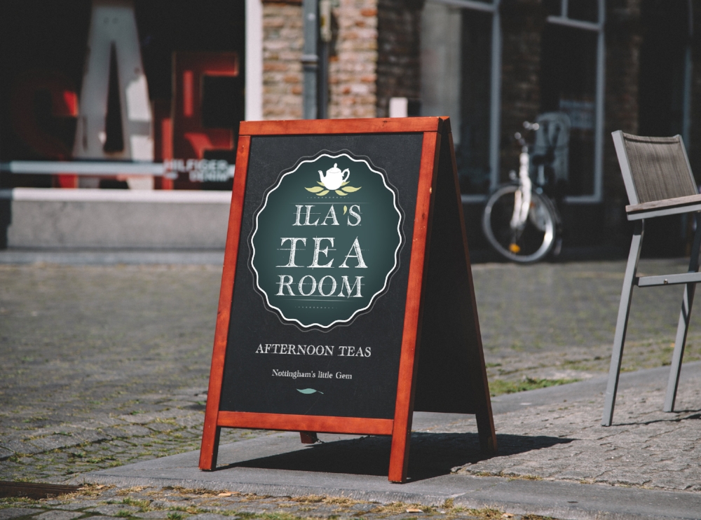
Templates - available from Graphic-burger. Putting the logo & Ila's slogan (personal) onto the chalkboard for effect. See the current chalk-board below to see the difference in execution.

Templates - available from Graphic-burger. Putting the logo & Ila's slogan (personal) onto the chalkboard for effect. See the current chalk-board below to see the difference in execution.

Applied with chalk-paint, how the display looks on Trinity walk.

Applied with chalk-paint, how the display looks on Trinity walk.

For the business cards, I followed the theme of having less repetitive elements and included Ila's name (first) to be placed on the front. And the back to include social media pages and contact information.

The front of Ila's contemporary (version) businness card.

The front of Ila's contemporary (version) businness card.

Here are the tote-bag ideas I had in mind just to see how the applied branding could appear on bags and accessories. Looking at templates on Graphic-burger (great resource).

Canvas bag - Ila's Tea Room concept.jpg

Currently I'm in the process of double-checking all the elements to be verified and sent to the printers, I have been receiving additional support via the ACES team at the Nottingham College, and they have been instrumental in helping me manage my schedule and progress.

Contemporary brands - logo inspiration

In Nottingham’s bustling centre there are a variety of quirky independent brands and shops that understand the marketing power of a strong visual identity. Having a clear, yet cohesive and easily recognizable branding this takes root from the kiss analogy in design – the simpler and refined a logo gets to, ultimately it is about capturing the essence of the brand – the company ethos, personality and client especially.


Examining The Specialty Coffee shop just located on 50 Friar Ln, Nottingham NG1 6DQ there is a strong bohemian-vibe to the interior and the graphical elements. Speaking the owner on previous visits, Michelangelo and his partner Lucy they are very passionate about their business and the facilitation of specialist coffees. The bohemian inspired decor interior within the place, creates a relaxing ambience and atmosphere - perfect for those busy commuters and professionals looking for respite from their busy schedules. Just below are a few snippets of the outside shop signage/frontage the whole – the use of white and minimalism consistently used throughout helps establish a calming feel.

Just the outside of the shop. Located on Nottingham, 50 Friar Ln, Nottingham NG1 6DQ.

Just the outside of the shop. Located on Nottingham, 50 Friar Ln, Nottingham NG1 6DQ.

Their instagram feeds where you can see owners Michaelangelo and Lucy showcase earthy sourced imagery promoting their passion for coffee! Customers/regulars also get involved with tagging their watery beverage @thespecialitycoffeeshop. The photos pr…

Their instagram feeds where you can see owners Michaelangelo and Lucy showcase earthy sourced imagery promoting their passion for coffee! Customers/regulars also get involved with tagging their watery beverage @thespecialitycoffeeshop. The photos promote their ethos and story, as seen from their website https://www.thespecialtycoffeeshop.com/story. This is a great addition to their homepage, giving visitors a glimpse into their passion and business.

Moving onto the 200 Degrees logo here for example, you can see minimal use of line work, a focal point on the numerical number alongside subtle textures. Being a minimal design, it is easier to identify and it's appeal is more wide-spread than something more historical. The world is affiliated with Starbucks & Neros/Costa and how, these behemoth chains operate and yet how identifiable their logos are – to create a timeless logo is to strip back to the essence of core themes/ideas associated with the brand. Applying this method ultimately is about extraction and eliminating unnecessary elements or ornamentation, which may detract the reasoning behind the design. For 200 Degrees its the colour, texture, earthy palettes bring association to the coffee/baristas and the quality of craftsmanship that goes into each cup. 

200-logo-696x458.jpg

Gaining further inspiration looking at Yumchaa's Teas and the simplicity of their contemporary logo design. Seen here (below) this remains wholly consistent throughout their online site and social media. Introducing witty design techniques to clearly establish to their audience of what they are all about! Simplicity really is the ultimate sophistication when it comes to producing a contemporary brand.

Yumchaa's official logo icon - for Twitter/instagram and social media.

Yumchaa's official logo icon - for Twitter/instagram and social media.

The head of steam outside signage just opposite the Nottingham Contemporary and Pitcher & Piano. This design similarly with 200 Degrees makes great use of rustic earthy tones, playing on the visual senses back to the industrial past. Having a cog around the main type gives an anchor to the typography and forces the eye to the centre.

The Head of Steam is located on 7 High Pavement, Nottingham NG1 1HF. Website : - http://www.theheadofsteam.co.uk

The Head of Steam is located on 7 High Pavement, Nottingham NG1 1HF. Website : - http://www.theheadofsteam.co.uk

Final Major Project : Ila's Little Tea Shoppe : Chapter One!

For my Final major project, in the back of my mind I was thinking about how I could help Ila Gamble months ago back in September. Since been given the initial brief, my immediate thought was of Ila and her Tea Shop on Trinity Walk. A few days after our college briefing I popped in and started chatting with her about my final major project, the proposal and what I intended to create for her. With my new found interest and development in Calligraphy (thanks to some historical essay writing!) I thought this kind of project would help push my skills in Calligraphy as well as logo design & branding. Combining both my interest in historical illustration and the techniques and processes going back to the mid 18th/19th centuries - would prove to be an interesting project for me to tackle! 

The front frontage shop of Ila's Little Tea Shoppe. As seen from the front, there is currently no visible applied sign display. Speaking to a few of her customers and regulars they sometimes would mention it can be challenging to find/locate in Nott…

The front frontage shop of Ila's Little Tea Shoppe. As seen from the front, there is currently no visible applied sign display. Speaking to a few of her customers and regulars they sometimes would mention it can be challenging to find/locate in Nottingham. This photograph proved to be a template for me to experiment further, such as 'mock-up' tests to see things in situ.

Since researching the origins and development of Afternoon Tea and how tea-houses in general have been developing and surviving up till now proved to be insightful. More established brands such as Betty's (1919) and the Hotel Ritz (London) all offer a distinct and glimpse to the past of England's favorite afternoon activity. Through examination of their existing branding, you understand how important the historical context is when tasked with redesigning a brand for a tea-shop.

First initial thumbnails for the shop's logo for Ila. Ultimately this proved to be one of the stronger designs out of the others I had then proceeded to develop later on. With a more customized calligraphic inspired typeface. 

First initial thumbnails for the shop's logo for Ila. Ultimately this proved to be one of the stronger designs out of the others I had then proceeded to develop later on. With a more customized calligraphic inspired typeface. 

Here is my selected menu concept cover for Ila's shop, utilizing a new logo design with refinement to the illustration as well. The illustrations give flavour and bite, inspired by the menus from Betty's I desired to have hand-designed aspects prese…

Here is my selected menu concept cover for Ila's shop, utilizing a new logo design with refinement to the illustration as well. The illustrations give flavour and bite, inspired by the menus from Betty's I desired to have hand-designed aspects present on it.

Since then I have been trying to produce more consistent illustrations in keeping with the two (above) more to come very soon! The finalized menu will still showcase Ila's original selected foods and drinks (which in my opinion are very tasty) to a more fully fleshed depiction. The illustrations are to be used in conjunction of calligraphic styled type as well.

The finalized logo and my favored design for Ila's Little Tea Shoppe. With some modifications and use of symmetry this design was utility for - business cards, gift cards and stamp signage for instance.

The finalized logo and my favored design for Ila's Little Tea Shoppe. With some modifications and use of symmetry this design was utility for - business cards, gift cards and stamp signage for instance.

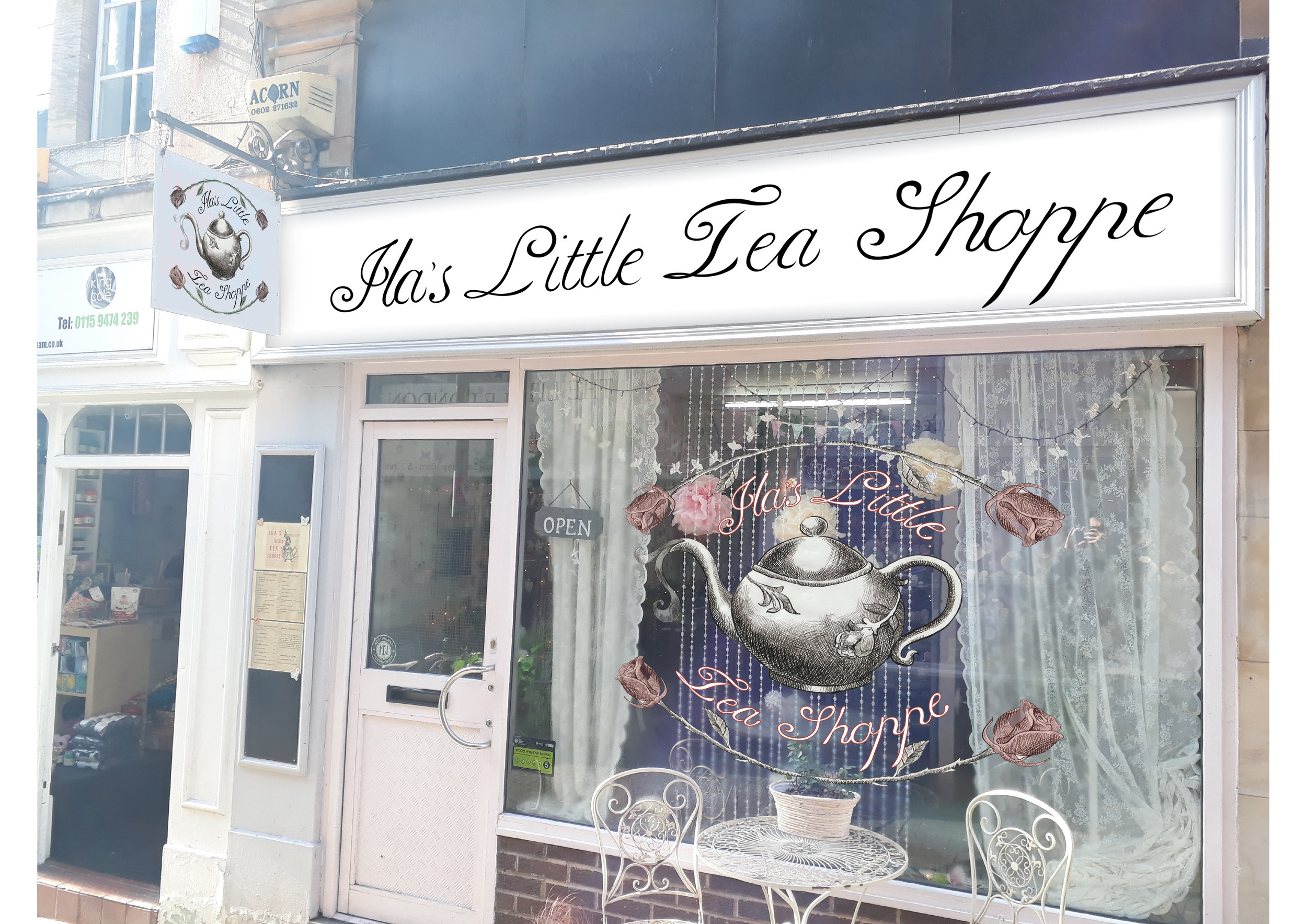
One of the stronger logo designs implemented onto her shop signage, more pre-visualization to show Ila and also for my VIVA presentation on the 22nd of March! For the window display my intention was for the illustration to be produced as a vinyl, to…

One of the stronger logo designs implemented onto her shop signage, more pre-visualization to show Ila and also for my VIVA presentation on the 22nd of March! For the window display my intention was for the illustration to be produced as a vinyl, to grab the attention of passerby's. 

Kavinsky's Outrun - A visual analysis

The album cover for Outrun draws multiple themes/inspiration from a particular kind of lifestyle, such living in Miami in the 1980s. The cover was designed by French electro house artist SebastiaAn.

The main elements of the cover include: the central protagonist, the sports car and the lightening bolt giving us an indication to the narrative/theme. The emphasis placed on the red K in the main title attracts the eye, inviting the viewing in. The sense of danger and excitement is visually portrayed from the car’s head lights, the night’s sky – referencing back to the American teenager.

Listening to the official soundtrack, synthesizers are heavily utilized throughout the album, these were used throughout the 70s and 80s - a definite nod to the time period set in Outrun. During the rebellious 1950s, American teenagers wanted to get away from their over-bearing parents, and wanted to have fun. Teens would often be out to the cinemas with the boyfriends or girlfriends, pulling up in fancy new cars. Instances of this can be seen in movies and television characters with established archetypes, such as the confident Jock in his jersey jacket.

The genres of film include the acting work of James Dean who promoted American youth culture during the 1950s. His most important film was Rebel Without a Cause (directed by Nicholas Ray), where he played a brooding red-jacketed teenager, named Jim Stark. His untimely death from a car crash, transfixed him into a cult figure of timeless fascination.


The term American Dream originally came from a historian in 1931 named James Truslow Adams, referring to That dream of a land in which life should be better and richer and fuller for every man, with opportunity for each according to his ability of achievement. The colonists of America represented the American Frontier, Thomas Jefferson claimed that everyone in America was “entitled to a life, liberty and pursuit of happiness”. It has since then evolved in the minds of all Americans as an ideal to aspire towards, this 'dream' that they could make their hopes/ambitions a reality.


0004089903_10.jpg
The Cover-art for 'Outrun' video game published by Sega in 1986. The developer behind the game was Yu Suzuki and Sega AM2. It was a commercial success when it was released, selling over 20,000 arcade cabinets with the game installed in it. The red s…

The Cover-art for 'Outrun' video game published by Sega in 1986. The developer behind the game was Yu Suzuki and Sega AM2. It was a commercial success when it was released, selling over 20,000 arcade cabinets with the game installed in it. The red sports car makes debut, and is actually a Ferrari Testarossa Spider, which is strikingly similar to the car on Kavinsky's 'Outrun'.

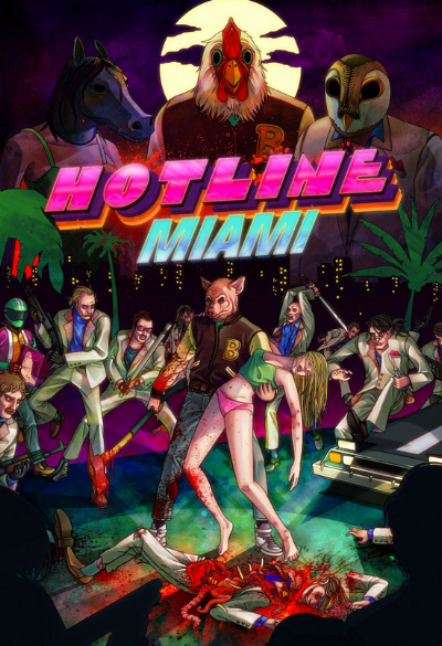
Hotline Miami is a game which was influenced by music score of Outrun. The game's narrative is incredibly visceral, with a teenager donning an animal mask. The lead character is named Jacket and is lead astray into the underworld of the Russian mafi…

Hotline Miami is a game which was influenced by music score of Outrun. The game's narrative is incredibly visceral, with a teenager donning an animal mask. The lead character is named Jacket and is lead astray into the underworld of the Russian mafia. The fast paced nature of the game allows the soundtrack to really shine, achieving great harmony. The teenage hero is also your typical archetype character, trying to save his girlfriend from certain doom. The pink-neon typeface in the poster is also synonymous with Miami, referring back to the nightlife of the city, and when the drug wars were rife.

Nicolas Winding Refn's Drive. In this poster there is a feeling of tension, and immanent action. Gosling has his eyes transfixed on something, purely focused on the job at hand. The typography from Drive and Kavinsky's Outrun do share some similarit…

Nicolas Winding Refn's Drive. In this poster there is a feeling of tension, and immanent action. Gosling has his eyes transfixed on something, purely focused on the job at hand. The typography from Drive and Kavinsky's Outrun do share some similarities regarding the design. The poster evokes a type of broodiness, within the central character – something just isn't right.

Understanding Semiotics

The concept of Semiotics is about the usage of signs and understanding how they impact on us. They are all around us, from road signs to stop signs, to traffic lights. 

They are a form of visual linguistics that have immense sway in our daily lives. 

For a quick exercise. .here is the Grey alien. It is an iconic image, and well known type of 'alien'. The signifying word here is Alien. The image/illustration itself is the signified or icon.

For a quick exercise. .here is the Grey alien. It is an iconic image, and well known type of 'alien'. The signifying word here is Alien. The image/illustration itself is the signified or icon.

What do you see in this sketch? Do you see just a mask, or more specifically an infamous character from a well known comic book? How has this particular icon, inspired a well known internet/hacker group?

What do you see in this sketch? Do you see just a mask, or more specifically an infamous character from a well known comic book? How has this particular icon, inspired a well known internet/hacker group?

A common site in shopping malls, and other convinence stores.

A common site in shopping malls, and other convinence stores.

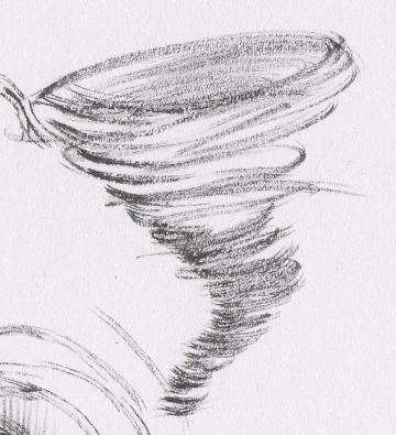
A destructive force of nature, that destroys all in its path. What is it?

A destructive force of nature, that destroys all in its path. What is it?

The Typographic Work of Jessica Hische

Hey!


Thanks for sparing the time to check out this little space! This marks my first official blog entry to my website. This place will be where I share my thoughts on the work of established Typographers and Illustrators in the creative industries. I'm currently based at New College Nottingham (NCN) doing my Foundation degree in Graphic Design (Illustration) which i'm currently enjoying - the challenges, learning curves and the importance of social networking!


Over the course of my summer holidays this year, I compiled research into a multitude of designers & illustrators, and one of whom who grabbed my attention was Jessica Hische.


Jessica's contributions within the graphic design realm is extensive, she has a book out titled In Progress which is a sneak-peak into her creative working process. Which is currently on my Amazon wish list this year.

To see her folio of work, you can visit her website here at : http://jessicahische.is/working


Since discovering her work, I was inspired to try my hand at typography and calligraphy which came with varying results. These exercises are a great way of creative problem solving, figuring out how to approach a certain type or font - which takes a steady hand and patience.


There must be a few of you out there who like me, do tend to procrastinate and put things off like you do. .You know that feeling, oh I'll do it later at x time, its something we all have to take responsibility of, and learning to forgive yourself m…

There must be a few of you out there who like me, do tend to procrastinate and put things off like you do. .You know that feeling, oh I'll do it later at x time, its something we all have to take responsibility of, and learning to forgive yourself more importantly. All those awesome personal projects, sketches and doodles that we LOVE to do because they make us feel good, but at the same time we still have that assignment by Ted we need to be working on!

Here is an example of some practice calligraphy I came up with last week. I did use a guide reference in illustrating this font, specifically the Gothic style. I've always admired Ye Olde Medieval texts and illuminations, the artistry present in the…

Here is an example of some practice calligraphy I came up with last week. I did use a guide reference in illustrating this font, specifically the Gothic style. I've always admired Ye Olde Medieval texts and illuminations, the artistry present in them and the symbolism. My affinity and appreciation of all things Medieval definitely came from my Mother who is quite the history buff. Just imagine those hundreds of years ago in Medieval Europe. . .monks and scribes having to HAND illustrate several hundred page plus tomes, and bibles for the monarchs and ruling bodies. Sometimes it could take between 6 months to a few years to illustrate a tome or illuminated manuscript.