Ila's Tea Room - Branding guidelines

Hello! It's been a few tumultuous weeks of preparation and organizing for our End of Year show this coming June. Currently I have been working into finalizing the brand-guidelines for my final major project. The show will be happening from the 20th to the 23rd of June at Broadway cinema, leaving us the 17th and 18th to set up our display areas accordingly.

For Ila's Tea Room condensing her core brand values and beliefs into a cohesive guideline was important in establishing consistency. In this booklet crucial information regarding Ila's brand is presented, from the details regarding the selected typography/type to the colour swatches in the final logo design. Branding stationery from the A6 flyers, business cards, menu, small scale art prints for principle use. All the nitty gritty elements that go into managing a brand, such as her audience. She expressed keen interest in diversifying her target audience, to attract Nottingham's younger professionals and students for example. As the majority of Nottingham's hospitality/cafe' scene is predominantly comprised of the established corporate chains, understanding Ila's independent competitors was important – such as White Rabbit/Thea Caffe'.

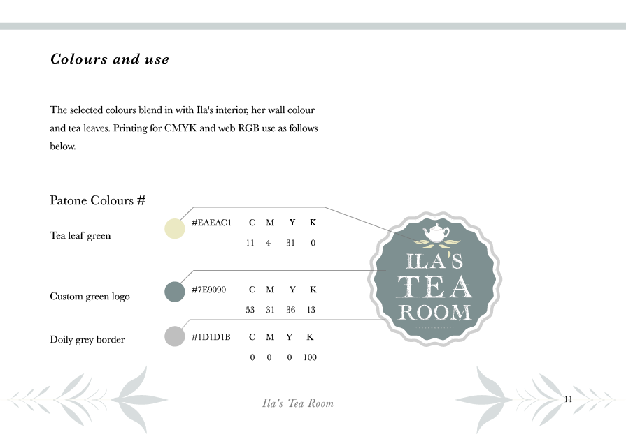
Colours and use page from the brand-guidelines. Outlining the RGB colours/pan-tone colours for printing and digital use.

Colours and use page from the brand-guidelines. Outlining the RGB colours/pan-tone colours for printing and digital use.

After previous visitations to Ila and her tea room, I further understood what kind of regular customers came to visit her. Her current brand 'Ila's Little Tea Shoppe', comments such as the shop's location were a regular concern. Customers would give feedback on specific logistical concerns about how to locate the tea-room, this was an important question and would be resolved by producing a vector map outlining its whereabouts. With a designed map as part of the menu, customers will be able to locate the tea-room with ease.


Example page from the Inspiration I collated in the beginnings of this project, from Charles Rennie Mackintosh's Willow Tearooms to the Yumchaa tea brand.
Example page from the Inspiration I collated in the beginnings of this project, from Charles Rennie Mackintosh's Willow Tearooms to the Yumchaa tea brand.

Ila's Tea Room - Final Project Update

Hello there! Since I handed in my final project from the 10th of May, I have been following upon the guidance of my tutors at Nottingham College and have embedded a more contemporary version which I produced over the weekend. Following advice from my brother and tutors (Richard/Sarah), I have implemented changes to further improve and make the design more suitable for mass audiences. What I have submitted below are the re-worked versions of the newer improved logo design, with carefully selecting colour palettes seen in Ila's tea shop I have went about - capturing the teapot and tea leaves with a suitable colour.

The amended design, after initial studies of Yumchaa's logos and more contemporary brands I pushed for a simplistic design - with a hand-drawn typeface and vector doiley effect, in keeping with some of the previous ideas in my file.

The amended design, after initial studies of Yumchaa's logos and more contemporary brands I pushed for a simplistic design - with a hand-drawn typeface and vector doiley effect, in keeping with some of the previous ideas in my file.

I have implemented a few situ images that tie the contemporary branding for Ila's here, they are an alternative branding concept to make it more accessible to a larger demographic. Understanding that the majority of her current audience base, consistent of more maturer ages having a clear and appealing brand image. Understanding the research that goes into a brand is one of the more critical aspects – who is your audience/market? What they want and how can your service/or product solve their problems and emotional needs. In this case for Ila's tea shop it was about creating a warm pleasant experience that will attract consumers from a myriad of ages, not just a maturer demographic – this was to be communicated through the branding elements I suggested in my proposal, such as the menu/flyers/business cards/brand guide-lines and the vinyl print.

Reflecting back to this Final major project, expanding upon more contemporary examples would have been much more beneficial earlier on. Having explored this then at a later, has definitely improved my design and confidence overall – and the execution of specific ideas. The additional situ designs showcase the additional contemporary brand assets, they are significantly different to the original submitted designs on the 10th.

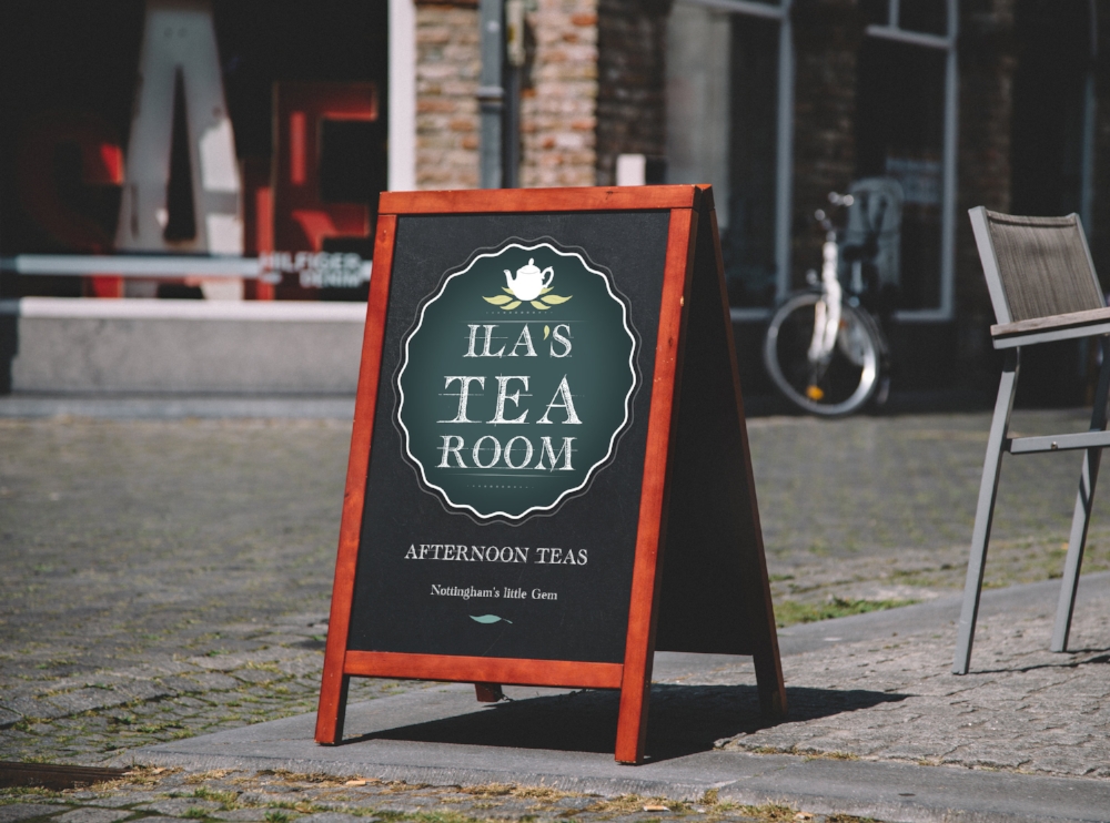
Templates - available from Graphic-burger. Putting the logo & Ila's slogan (personal) onto the chalkboard for effect. See the current chalk-board below to see the difference in execution.

Templates - available from Graphic-burger. Putting the logo & Ila's slogan (personal) onto the chalkboard for effect. See the current chalk-board below to see the difference in execution.

Applied with chalk-paint, how the display looks on Trinity walk.

Applied with chalk-paint, how the display looks on Trinity walk.

For the business cards, I followed the theme of having less repetitive elements and included Ila's name (first) to be placed on the front. And the back to include social media pages and contact information.

The front of Ila's contemporary (version) businness card.

The front of Ila's contemporary (version) businness card.

Here are the tote-bag ideas I had in mind just to see how the applied branding could appear on bags and accessories. Looking at templates on Graphic-burger (great resource).

Canvas bag - Ila's Tea Room concept.jpg

Currently I'm in the process of double-checking all the elements to be verified and sent to the printers, I have been receiving additional support via the ACES team at the Nottingham College, and they have been instrumental in helping me manage my schedule and progress.

Contemporary brands - logo inspiration

In Nottingham’s bustling centre there are a variety of quirky independent brands and shops that understand the marketing power of a strong visual identity. Having a clear, yet cohesive and easily recognizable branding this takes root from the kiss analogy in design – the simpler and refined a logo gets to, ultimately it is about capturing the essence of the brand – the company ethos, personality and client especially.


Examining The Specialty Coffee shop just located on 50 Friar Ln, Nottingham NG1 6DQ there is a strong bohemian-vibe to the interior and the graphical elements. Speaking the owner on previous visits, Michelangelo and his partner Lucy they are very passionate about their business and the facilitation of specialist coffees. The bohemian inspired decor interior within the place, creates a relaxing ambience and atmosphere - perfect for those busy commuters and professionals looking for respite from their busy schedules. Just below are a few snippets of the outside shop signage/frontage the whole – the use of white and minimalism consistently used throughout helps establish a calming feel.

Just the outside of the shop. Located on Nottingham, 50 Friar Ln, Nottingham NG1 6DQ.

Just the outside of the shop. Located on Nottingham, 50 Friar Ln, Nottingham NG1 6DQ.

Their instagram feeds where you can see owners Michaelangelo and Lucy showcase earthy sourced imagery promoting their passion for coffee! Customers/regulars also get involved with tagging their watery beverage @thespecialitycoffeeshop. The photos pr…

Their instagram feeds where you can see owners Michaelangelo and Lucy showcase earthy sourced imagery promoting their passion for coffee! Customers/regulars also get involved with tagging their watery beverage @thespecialitycoffeeshop. The photos promote their ethos and story, as seen from their website https://www.thespecialtycoffeeshop.com/story. This is a great addition to their homepage, giving visitors a glimpse into their passion and business.

Moving onto the 200 Degrees logo here for example, you can see minimal use of line work, a focal point on the numerical number alongside subtle textures. Being a minimal design, it is easier to identify and it's appeal is more wide-spread than something more historical. The world is affiliated with Starbucks & Neros/Costa and how, these behemoth chains operate and yet how identifiable their logos are – to create a timeless logo is to strip back to the essence of core themes/ideas associated with the brand. Applying this method ultimately is about extraction and eliminating unnecessary elements or ornamentation, which may detract the reasoning behind the design. For 200 Degrees its the colour, texture, earthy palettes bring association to the coffee/baristas and the quality of craftsmanship that goes into each cup. 

200-logo-696x458.jpg

Gaining further inspiration looking at Yumchaa's Teas and the simplicity of their contemporary logo design. Seen here (below) this remains wholly consistent throughout their online site and social media. Introducing witty design techniques to clearly establish to their audience of what they are all about! Simplicity really is the ultimate sophistication when it comes to producing a contemporary brand.

Yumchaa's official logo icon - for Twitter/instagram and social media.

Yumchaa's official logo icon - for Twitter/instagram and social media.

The head of steam outside signage just opposite the Nottingham Contemporary and Pitcher & Piano. This design similarly with 200 Degrees makes great use of rustic earthy tones, playing on the visual senses back to the industrial past. Having a cog around the main type gives an anchor to the typography and forces the eye to the centre.

The Head of Steam is located on 7 High Pavement, Nottingham NG1 1HF. Website : - http://www.theheadofsteam.co.uk

The Head of Steam is located on 7 High Pavement, Nottingham NG1 1HF. Website : - http://www.theheadofsteam.co.uk

Final Major Project : Ila's Little Tea Shoppe : Chapter One!

For my Final major project, in the back of my mind I was thinking about how I could help Ila Gamble months ago back in September. Since been given the initial brief, my immediate thought was of Ila and her Tea Shop on Trinity Walk. A few days after our college briefing I popped in and started chatting with her about my final major project, the proposal and what I intended to create for her. With my new found interest and development in Calligraphy (thanks to some historical essay writing!) I thought this kind of project would help push my skills in Calligraphy as well as logo design & branding. Combining both my interest in historical illustration and the techniques and processes going back to the mid 18th/19th centuries - would prove to be an interesting project for me to tackle! 

The front frontage shop of Ila's Little Tea Shoppe. As seen from the front, there is currently no visible applied sign display. Speaking to a few of her customers and regulars they sometimes would mention it can be challenging to find/locate in Nott…

The front frontage shop of Ila's Little Tea Shoppe. As seen from the front, there is currently no visible applied sign display. Speaking to a few of her customers and regulars they sometimes would mention it can be challenging to find/locate in Nottingham. This photograph proved to be a template for me to experiment further, such as 'mock-up' tests to see things in situ.

Since researching the origins and development of Afternoon Tea and how tea-houses in general have been developing and surviving up till now proved to be insightful. More established brands such as Betty's (1919) and the Hotel Ritz (London) all offer a distinct and glimpse to the past of England's favorite afternoon activity. Through examination of their existing branding, you understand how important the historical context is when tasked with redesigning a brand for a tea-shop.

First initial thumbnails for the shop's logo for Ila. Ultimately this proved to be one of the stronger designs out of the others I had then proceeded to develop later on. With a more customized calligraphic inspired typeface. 

First initial thumbnails for the shop's logo for Ila. Ultimately this proved to be one of the stronger designs out of the others I had then proceeded to develop later on. With a more customized calligraphic inspired typeface. 

Here is my selected menu concept cover for Ila's shop, utilizing a new logo design with refinement to the illustration as well. The illustrations give flavour and bite, inspired by the menus from Betty's I desired to have hand-designed aspects prese…

Here is my selected menu concept cover for Ila's shop, utilizing a new logo design with refinement to the illustration as well. The illustrations give flavour and bite, inspired by the menus from Betty's I desired to have hand-designed aspects present on it.

Since then I have been trying to produce more consistent illustrations in keeping with the two (above) more to come very soon! The finalized menu will still showcase Ila's original selected foods and drinks (which in my opinion are very tasty) to a more fully fleshed depiction. The illustrations are to be used in conjunction of calligraphic styled type as well.

The finalized logo and my favored design for Ila's Little Tea Shoppe. With some modifications and use of symmetry this design was utility for - business cards, gift cards and stamp signage for instance.

The finalized logo and my favored design for Ila's Little Tea Shoppe. With some modifications and use of symmetry this design was utility for - business cards, gift cards and stamp signage for instance.

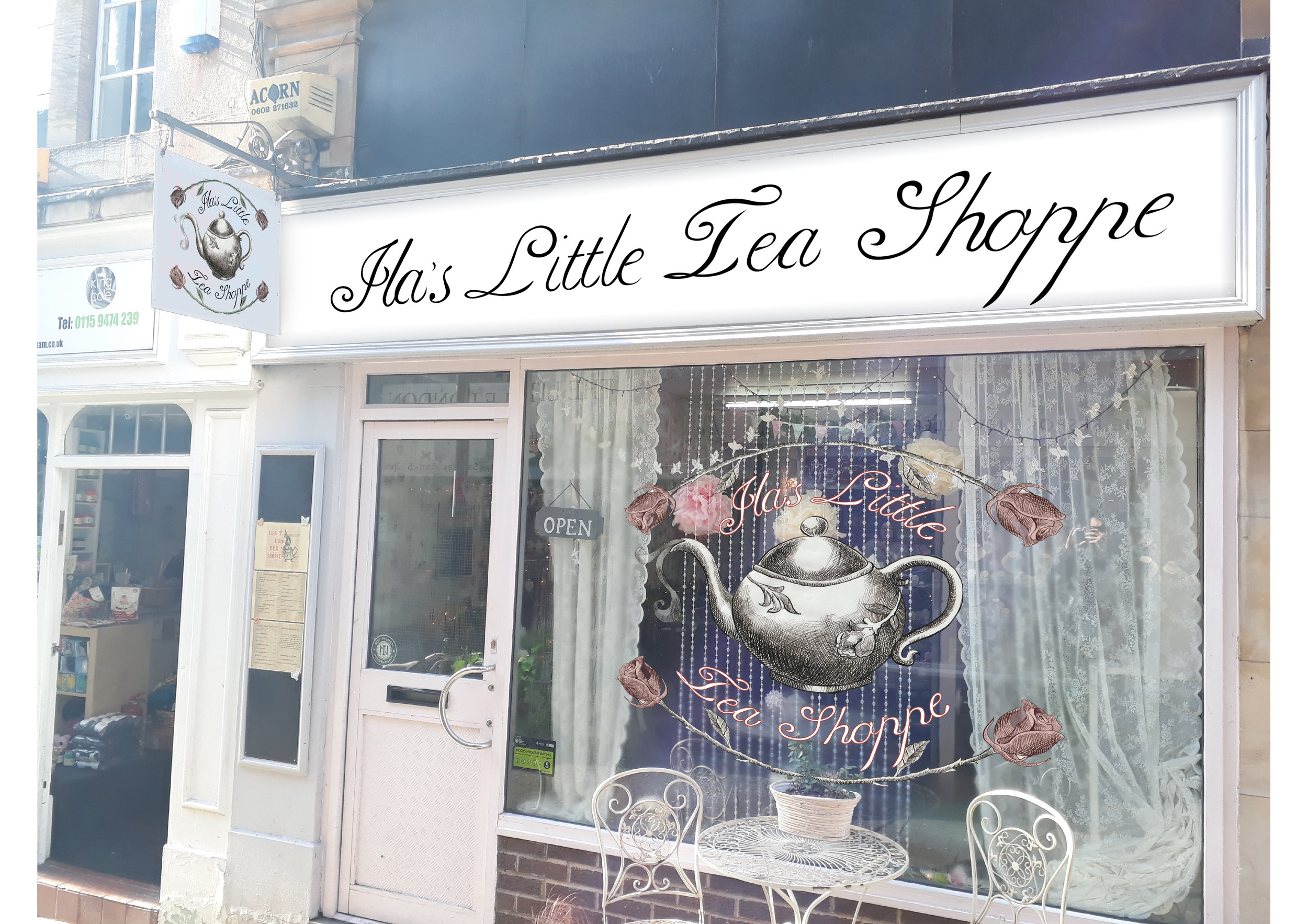
One of the stronger logo designs implemented onto her shop signage, more pre-visualization to show Ila and also for my VIVA presentation on the 22nd of March! For the window display my intention was for the illustration to be produced as a vinyl, to…

One of the stronger logo designs implemented onto her shop signage, more pre-visualization to show Ila and also for my VIVA presentation on the 22nd of March! For the window display my intention was for the illustration to be produced as a vinyl, to grab the attention of passerby's.